Anúncios
You’re standing at a crossroads where digital invention meets a renewed hunger for handmade craft. Collectors now favor tangible work and visible process, yet they still welcome smart, new tools that aid idea making.
This shift affects your portfolio, pricing, and how you tell the story behind each piece. Affordable originals under $2,000 are selling well, and more buyers want direct relationships with creators online.
In the studio and in client projects, expect color and material cues — teal, lime, violet, ice blue, velvet, gold frames, and mixed-media surfaces — to shape product and interior choices. You’ll learn which design signals matter, and how to use them to keep your signature alive.
For a deeper look at how generated work compares to handmade pieces and what it means for rights and authorship, read this close analysis on generated vs. handmade work: generated vs. handmade.
The 2026 Creative Landscape: Where Human Craft Meets Intelligent Tools
The market favors work with tactile presence—brushstrokes, seams, and texture that read as human-made. Collectors hungry for authenticity are choosing pieces that show process and time. This shift opens room for both emerging and established creators to connect directly with buyers.
Why your audience craves authenticity in a screen-saturated world
Your buyers want visible craft and honest stories. Long-form storytelling and behind-the-scenes posts turn casual viewers into committed supporters. That trust makes affordable originals under $2,000 a real gateway for new collectors.
Reading the signals: from affordable originals to immersive experiences
- Signal: Affordable originals are rising—prioritize your own shop and mailing list.
- Signal: Galleries that teach and host experiences outperform exclusivity.
- Signal: Texture, mixed media, and hand-finished details sell better in person.
How tools shift, not replace, your role in the creative industries
“Your taste, choices, and decisions remain the value collectors pay for.”
Use intelligent tools to speed reference gathering and admin, while protecting time for experimentation. Designers and artists who document process build resilience as platforms change.
AI art trend 2026: What’s real, what’s hype, and what actually changes your work
Tools that speed idea work are useful, but they only matter when you translate those ideas into your own visual language. You’ll use fast ideation for moodboards, composition studies, and reference gathering. Then you convert the best directions into pieces that show your hand.
From novelty to utility: where tools add value in design and art workflows
You can lean on quick generators to map lighting, materials, and layout. Use them to previsualize choices before committing to final craft.
Make a shortlist of palette, motif, and typography so those helpers speed your workflows without flattening your signature.
Risks and guardrails: style collapse, noise, and brand authenticity
Create a review system that flags style collapse when work starts to look the same. Reduce noise by defining precise prompts or visual constraints that serve your brief.
Document process and be transparent about when you use technology in client deliverables. That honesty protects your brand and keeps collectors trusting your practice.
- Use tools for rapid options, then refine by hand.
- Set brand guardrails to preserve focus and differentiation.
- Integrate graphic design checks to ensure cohesive approvals.
Materiality and Texture Take Center Stage
Tactile surfaces are stealing the spotlight as creators layer unexpected materials to build real weight and presence.
Hyper-tactility shows up in ash, plaster, ceramics, industrial compounds, and textiles. You can use these mixes to create sculptural canvases that reward in-person viewing while still photographing strongly for your shop or social pages.
Collectors now seek handcrafted qualities that counter endless screens. That demand lets you position work as premium by emphasizing seams, edges, and transitions as core design signals.
Hyper-tactility: ash, plaster, textiles, and sculptural canvases with depth
Mix fabric, leaf, and layered surfaces to blur painting and sculpture. Plan for weight, mounting, and shipping early so large pieces stay saleable.
Blurring painting and sculpture: mixed media, objects, and handcrafted surfaces
Document your process—mixing compounds, drying times, and inlay choices—to show why textured work commands higher prices.
| Material | Visual Effect | Studio Consideration | Collector Benefit |
|---|---|---|---|
| Ash / Plaster | Matte sculptural relief | Ventilation, curing time | Visible craft, tactile depth |
| Textiles / Fabric Inlay | Soft contrast, layered color | Seaming, adhesive longevity | Warmth, tactile storytelling |
| Gold / Copper Leaf | Luminous highlights | Specialist application, sealing | Dynamic light play, premium finish |
| Plexiglass / Objects | Dimensional forms | Mounting, weight planning | Installation-ready statement |
“Prioritize edges and transitions—they tell the making story.”
Visual Language for 2026: Dual Palettes and Surreal Minimalism
A clear visual system—rich base tones plus a single bright counterpoint—keeps work both calm and bold. Use warm ochre, burnt terracotta, moss green, and clay red as your anchors. Then add one high-voltage accent like electric coral or neon aqua to create a decisive focal pop.
Earth tones 2.0 vs. electric pastels
Earth tones 2.0 give your pieces warmth and a sense of craft. Pair them with glowing lilac, acid green, or ice blue to make contrast that reads on screens and reads even better in a room.
Surreal minimalism for focus and story
Keep forms clean and spare. Then introduce one uncanny element—a floating object, an elongated shadow, or impossible texture—to anchor the viewer’s attention.
“Add one strange detail and the whole composition gains narrative.”
Typography that respects texture
Choose typography with generous tracking and sturdy weights so type stays legible over relief and textured surfaces. Build a type scale where large headings complement sculptural canvases and small captions sit quietly.
- Pair a grounded base with one luminous accent to balance emotion and restraint.
- Test legibility and contrast so your color-forward systems remain accessible.
- Document your visual choices so collectors and clients see why each element matters.
Scale, Space, and Immersion: Designing for Depth and Experiential Impact
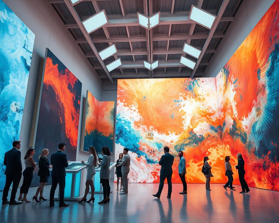
Big canvases and installations let viewers enter a composition rather than just view it. That sense of presence creates meaningful depth and makes a room feel intentional.
Oversized artworks as anchors
Choose one statement piece to focus a room and simplify decisions for clients. An oversized work reduces visual clutter and gives a premium, editorial look.
Design with negative space so the piece breathes. Plan modular panels for easier shipping and flexible installation.

Playful surrealism in installations
Use light, shadow, and carefully scaled objects to let visitors “step into” a story. Small budgets can still yield immersive setups by layering simple elements and smart sightlines.
- Capture scale with human references, wide shots, and close-ups.
- Coordinate early with designers and installers on wall size and lighting temperature.
- Turn immersive moments into graphic design assets for displays and motion clips.
“Galleries that teach and stage immersive shows convert curiosity into lasting interest.”
Market Signals You Can Act On Now
Market shifts are opening clear chances for makers to sell entry-level originals and still protect higher-end work.
Affordable originals under $2,000 are gaining traction as the ultra-high end cools. You can use this to widen your audience while keeping signature pieces rare.
Rise of affordable originals and the emerging-artist focus
Price strategically with entry-level originals and limited editions. These offerings attract first-time buyers without devaluing premium pieces.
Position your product mix so it serves new collectors and repeat clients. Offer one-of-a-kind work alongside small runs that scale.
Direct-to-collector relationships: building trust through process and story
Build direct channels—newsletter, shop, and studio visits—to control the relationship and cut platform fees.
Document your process and share long-form posts that show how pieces are made. That transparency turns casual followers into committed collectors.
- Collaborate with designers to reach interiors and hospitality buyers.
- Use launch calendars and themed drops to create steady interest each quarter.
- Collect social proof: testimonials, installation photos, and press mentions to ease purchase decisions.
| Signal | Action | Benefit |
|---|---|---|
| Affordable originals | Offer entry-level originals and limited editions | Broader collector base, steady sales |
| Direct sales | Build newsletter, shop, studio visits | More control, lower fees |
| Process transparency | Publish behind-the-scenes and long-form stories | Stronger brand trust and repeat buyers |
| Designer collaborations | Partner with designers and graphic design firms | Access to interiors market and higher-value commissions |
“Turn market signals into a quarterly plan—launch calendars, themed drops, and behind-the-scenes content.”
Color and Aesthetics: What’s Trending Across Media
Expect palettes that pair luminous cools with warm, tactile bases to guide packaging, interiors, and graphic design.
Transformational teal, lime green, violet, and ice blue work as flexible anchors. Use them in seasonal palettes that translate across screen and print. They read modern on product labels and strong in environmental graphics.
Medieval and Baroque echoes—curves, ornament, and gilt frames—add emotional depth. Apply these forms sparingly so decorative elements feel intentional, not heavy. One framed motif can carry a whole composition.
Texture matters: leafing, velvet, and plexiglass give dimension that photographs well and rewards in-person viewing. Plan color management so hues stay true from screen mockups to wall installs.
- Mix cool futurist hues with warm earth bases for balance.
- Use ornament and forms as accents, not patterns, to avoid clutter.
- Document palette recipes and usage notes for collaborators.
| Element | Use | Design Consideration |
|---|---|---|
| Teal / Ice Blue | Accent, focal pop | Color profiles for screens and print |
| Lime / Violet | Seasonal palettes, product labels | Contrast with warm neutrals for legibility |
| Leafing / Velvet | Subtle luxury cues | Photograph lighting and sealing for durability |
| Curves / Gold Frames | Emotional depth and brand voice | Use sparingly; one hero element guides the mood |
Your 2026 Workflow: Tools, Skills, and Processes That Scale
Set a simple weekly rhythm so idea work, making, and sales each get their own focused day. That rhythm protects deep focus and makes your work reliable to collectors and collaborators. Keep steps explicit so you can repeat what works.
Co-pilot ideation, references, and texture studies
Use an intelligent co-pilot for fast references and rough texture studies, then keep the final choices for your hand. One quick pass gives many directions; your decisions give those directions a signature.
Run small texture tests digitally, then match them to plaster, textiles, or leafing in the studio. This saves time and keeps the physical finish true to the idea.
Apps and pipelines that respect handcrafted work
Select a compact stack: an asset manager, a prompt notebook, a vector tool, and a raster editor. Pick apps that export clean files so handoff between steps stays smooth.
- Organize assets for fast lookups and version control.
- Standardize color profiles to avoid surprises when you move from screen to studio.
- Batch tasks to protect your deep-focus days and scale output.
From visuals to prints and tactile outcomes
Create production-ready files with CMYK builds, bleeds, and embedded profiles so your prints land true. Prepare archival papers and coatings that match textured originals.
Track your skills—material mastery, lighting for documentation, and finishing—so every release reads intentional and tight to buyers and designers.
“Document decisions, not just images; collectors buy the why as much as the work.”
- Modular workflow: ideate, build, finish, publish.
- Pick apps that save time and keep quality high.
- Prepare prints and note specs for each release.
- Keep a public process log to build trust and sales—see planning resources like predictions and planning.
Galleries, Live Experiences, and the Return of the Visible Artist
Galleries that open up process and people are drawing attention and sales. When you stage demos, Q&A, and guided walkthroughs, visitors feel invited instead of sold to.
Immersive shows, demos, and long-form storytelling to cut through digital noise
Design shows that center process and personality make buyers confident. Offer demo hours, artist talks, and clear wayfinding so visitors connect with the work and the maker.
Produce long-form content around each show: studio films, essays, and behind-the-scenes posts that continue the story after the opening. That content drives repeat visits and keeps traffic compounding over years.
- Script a narrative arc so every room and plinth advances the story and eases decisions.
- Curate visuals for social with intimacy and clarity to cut through online noise.
- Work with designers on signage, lighting, and flow so the space is photogenic and intuitive.
- Collect emails and DMs during the event; follow up with offers, payment options, and installation support in good time.
“Repeat what works annually and watch a rhythm compound into community.”
Conclusion
Finish the year with a clear plan that pairs hand skills and smarter tools to keep your practice resilient.
Prioritize authenticity and material richness. Make texture and textures the proof points that give your work depth, not noise. Keep one strong element per release so each piece reads as intentional.
Set a simple release calendar and tidy workflows. Use compact apps and type systems so typography and visuals stay consistent from product to prints.
Build direct channels with collectors, show process, and collaborate with designers. That way your style and brand stay unmistakable as trends shift in the coming years.


